
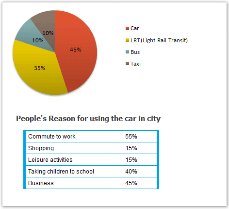
The pie graph illustrates the proportions of types of transportation that are used in Edmonton, and the table demonstrates what the residents use the cars for.
Overall
, what stands out from the chart is that cars accounted for the highest usage percentage Linking Words
while
the table shows that business, work and taking the children to school are the most purposes of car use.
First of all, it is noted that cars accounted for nearly half of car users for commuting. Linking Words
In contrast
, taxis and buses are the least when both of them are chosen by only 10% of citizens. Linking Words
Moreover
, the railway system has a usage proportion of 35%, accounting for more than a third.
Another striking factor is that they mostly drive their automobiles to move to their workplaces when its figure is 55%. Linking Words
Next,
Linking Words
it is clear that
businesses and delivered kids to schools are the next highest purpose of use by the residents, 45% for the former and 40% for the latter. Linking Words
Finally
, on the opposite trend, going shopping and doing leisure activities are the less when either of them only accounts for 15%.Linking Words