
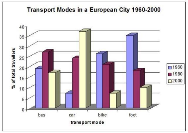
The bar chart illustrates European cities' various kinds of transport used for work between 1960 to 2000.
Overall
, car rates are the only transport that keeps increasing over the years.
In detail, the use of travelling by car had the lowest number of Linking Words
users
in 1960 for only about 6% of the population, but it jumped to almost 5 times more in 1980, Use synonyms
then
in 2000 it reached its highest peak of Linking Words
users
for more than 40% of the population.
Walking used to be the most popular choice of transport in 1960, but it experienced a huge drop in 1980, from around 35% to about 18% and it dropped even Use synonyms
further
in 2000. Bike Linking Words
users
Use synonyms
also
slightly decreased from around 25% in 1960 to about 20% in 2000.
Linking Words
Travellers
rate by bus started from about 20% of the Change noun form
Travellers'
Traveller's
users
in 1960 Use synonyms
then
received its peak in 1980 with about 25% of the total Linking Words
users
, but Use synonyms
then
it hit its lowest rate in 2000, with just about 18% of the Linking Words
users
.Use synonyms