
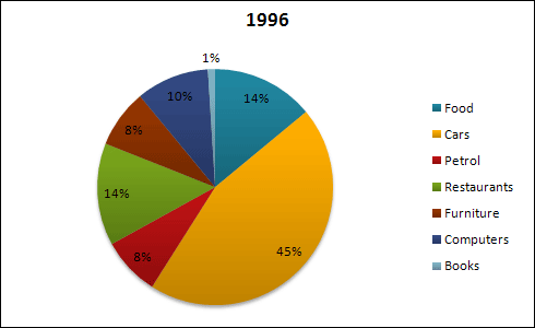
The pie charts provide information on
American’s
expense breakdown in two separate years(1966, and 1996). On the whole, the largest expenditure shifted from Correct your spelling
America’s
food
to cars during the period.
Looking at the data from 1966, people used to pay 44 Use synonyms
percent
of their money on Change the spelling
per cent
food
. The car expenditure followed Use synonyms
food
by spending 23 Use synonyms
percent
of the total that year. The rest consists of petrol, restaurant, furniture, books, and computers, respectively 9%,7%,10%, and 6%.
Turning to the data from 1996, the preference has shifted. Change the spelling
per cent
Food
expenses dramatically dropped to 14%, Use synonyms
while
restaurant expenditures doubled. There was a significant increase in car spending to 45%, interestingly, the petrol expense decreased by 1%. Linking Words
Furthermore
, American people began spending six Linking Words
percent
of their money on computers Change the spelling
per cent
instead
of books.
Linking Words
To conclude
, American people have changed their spending from Linking Words
food
to cars and restaurants.Use synonyms