
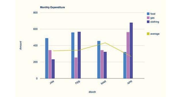
This
provided bar chart illustrates the expenditures of a family living in the USA in dollars to buy three things, Linking Words
food
, Use synonyms
gas
, and clothing during four months, in 2010. Use synonyms
Overall
, it can be seen that the levels of expenses for the three items fluctuated over the given period.
Linking Words
To begin
, in January spending on Linking Words
food
was the highest, at approximately 500$ compared to Use synonyms
gas
and clothing. Use synonyms
However
, in February, there was a slight rise in buying Linking Words
food
, at just around 550$, Use synonyms
then
; it dropped over the next period to be the lowest expenditure, in April, at about 350$.
Linking Words
In addition
to that, the pattern of spending on Linking Words
gas
was opposite to Use synonyms
food
, Use synonyms
whereas
it started in January, at around 350$, and Linking Words
then
it declined, in February, at just about 210$. After that, there was a slight rise in spending on Linking Words
gas
, in March, and Use synonyms
then
it was a dramatic increase in April, at around 520$.
In January, if clothing expenses are compared to Linking Words
food
, it will be the contrary, because it was the lowest expenditure for clothing, and Use synonyms
then
; it became at the same level as Linking Words
food
in February, at nearly 580$. Use synonyms
Although
it plummeted slightly in March than Linking Words
gas
, in April the most expenses were for clothing, at just over 600$.Use synonyms