The graph below shows the amounts of waste produced by three companies over a period of 15 years. Summarize the information by selecting and reporting the main features, and make comparisons where relevant. Write at least 150 words.

The graph below shows the amounts of waste produced by three companies over a period of 15 years.

Summarize the information by selecting and reporting the main features, and make

comparisons where relevant.

Write at least 150 words.
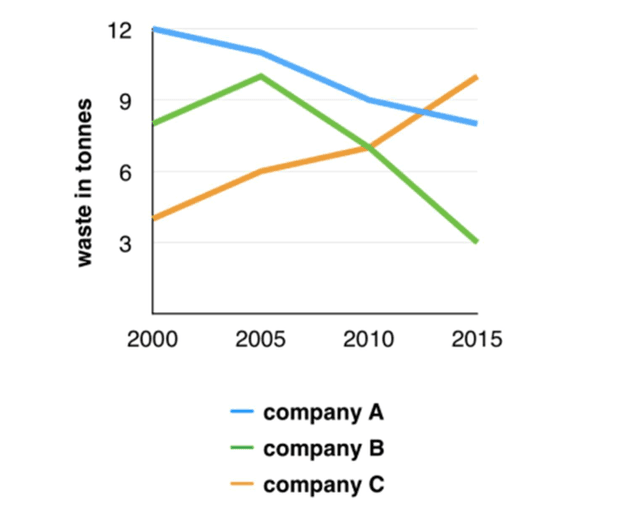
The chart illustrates how much waste was produced by the three companies over the period from 2000 to 2015. The units are measured in tonnes.
Overall
, both companies A and B produced less and less misuse over 15 years,
whereas
company C has produced nearly double the amount of trash tonnes. In the year 2000, Company A produced the highest quantity of leftovers, 12 tonnes, remaining the corporation with wasted the most nearly until the middle of the period from 2010 to 2015, when Group C was reaching to the top. Meanwhile, Company B started from around 8000 kilograms in 2000,
then
it peaked at above 9000 kilograms and the amount of trash started to decrease till 2015. In conclusion, It can clearly be seen that association C was the only one that went steadily downhill for 15 years. After 2010, it completely outclassed both brands A and B, becoming the most toxic enterprise by 2015
Submitted by Alexandre Harvey on

Unauthorized use and/or duplication of this material without express and written permission from this site’s author and/or owner is strictly prohibited. Excerpts and links may be used, provided that full and clear credit is given to Writing9 with appropriate and specific direction to the original content.

Basic structure: Change the fourth paragraph.
Vocabulary: Only 6 basic words for charts were used.
Vocabulary: The word "amount" was used 2 times.
Vocabulary: The word "nearly" was used 2 times.
Vocabulary: Use several vocabularies to present the data in the fourth paragraph.
What to do next:
Look at other essays: