
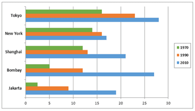
This
bar graph illustrates the rise in the population of five metropolitan areas around the world between 1970 and 2010.
Linking Words
Overall
, Tokyo had the largest populace in 2010, but the number of residents of Bombay and Jakarta increased tremendously. Linking Words
In addition
, the inhabitants of New York grew gradually(step by step) over the period.
Linking Words
According to
the bar diagram more than 15 million people lived in Tokyo in 1970 and that was three and five times higher than Bombay and Jakarta respectively, Linking Words
also
it was more for 2 and 4 million people in the other two cities. New York and Shanghai had approximately 14 and 12 million residents in 1970. In the next four decades, Tokyo’s people almost doubled and it retained the top position. New York was the second largest city but it became the least populated city in 2010. Surprisingly in 2010 population growth in Bombay and Jakarta outranked and exceeded all other cities.Linking Words