
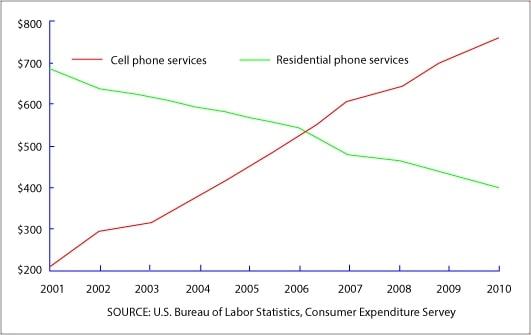
The given line graph illustrates the total spending on mobile phones and technological-device services in residences over 9 years, spanning from 2001 to 2010.
Overall
, Linking Words
it is clear that
there were inverse trends comparing these two categories of expenditure during the period. Linking Words
While
more and more people opted to spend money on personal phones, the percentage of residential phone assistance seemingly declined over the same time.
As is represented, from 2001 to 2010, there was an upward trend in cell phone usage proportion, ranging from the lowest at over 200 Linking Words
dollars
to the highest point at more than half of 700 Use synonyms
dollars
. The trend positively showed signs of continuous improvements.
Use synonyms
However
, regarding phone services for civilians, the rate dramatically dropped over the period, from its peak at approximately 700 Linking Words
dollars
in 2001 to its minimum point of nearly 400 Use synonyms
dollars
in 2010. Use synonyms
This
trend did not change from 2010 onwardsLinking Words