
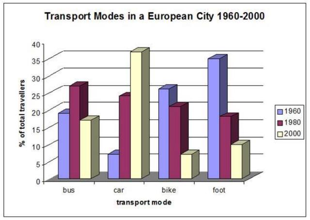
The graph illustrates the distinctive types of transportation used to trip and work for three different years in one city in Europe.
As a general trend,
it is clear that
car operation became the most popular operation of conveyance in 2000. As a fascinating fact, there was a downward trend in bike usage every year.
Linking Words
To begin
with, the number of car users stood at 6% of the total in the first year and increased dramatically to more than 20% in 1980. Linking Words
This
phenomenon pretended to grow at 36% in 2000, making it the highest transport model utilized among the others in the Linking Words
last
year. Linking Words
On the other hand
, in 1960, many samples were concerned to use the bicycle approximately at 25% but it decreased slightly by 5% in 1980. Linking Words
In addition
, Linking Words
this
tendency continued to decline significantly at 6%, which is the lowest form of transport for travellers in 2000.Linking Words