
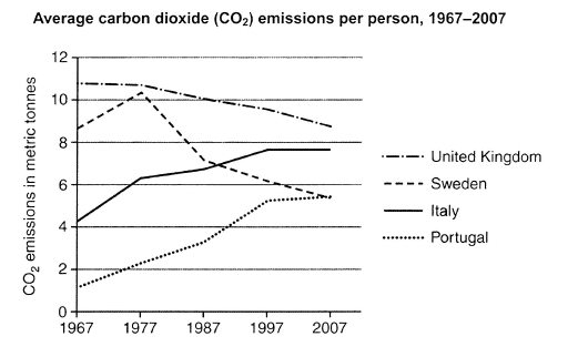
The graph presents the data based on the average of carbon dioxide emissions in terms of one person in four European countries from 1967 to 2007.
Overall
, the average of CO2 emissions in the four countries of Europe varies from each other. The most noticeable changes are the decreasing numbers in the United Kingdom and Linking Words
Sweden
, Use synonyms
whereas
Italy and Portugal show increased numbers.
In 40 years, the citizens of Linking Words
Sweden
have increased carbon dioxide emissions from approximately 8.5 to a little above 10Use synonyms
,
but showed intense dive after 1977 before laying at 5 in 2007. The same goes for the United Kingdom, which lessen their emitted carbon dioxide, even though it was not as extreme as Remove the comma
apply
Sweden
.
In comparison, Italy and Portugal showed an increasing average. In terms of Italy, their emission grew from 4 to 7.5 throughout 30 years, before maintaining it until 2007. It is noteworthy that only Use synonyms
Sweden
displayed fluctuating data, whilst the three other countries had stable growth or reduction.Use synonyms