
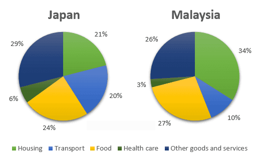
The pie charts illustrate the average household expenditure in two different countries (
Malaysia
and Use synonyms
Japan
) on five different categories (housing, transport, food, health care, and other goods and service) in one particular year (2010).
Use synonyms
Overall
, housing made up the highest proportion of expenditure in Linking Words
Malaysia
, Use synonyms
while
in Linking Words
Japan
, it was on other goods and services. Use synonyms
Furthermore
, both countries had the lowest spending on healthcare.
With regards to housing, Linking Words
Malaysia
spent more money on it as opposed to Use synonyms
Japan
at around a third (34%) and approximately a fifth (21%) respectively. Use synonyms
Similarly
, the former country had more spending on food compared to the latter by 3%.
In terms of other goods and services, people in Linking Words
Japan
spend more of their income in Use synonyms
this
category than those who were in Linking Words
Malaysia
by a small fraction (3%). Use synonyms
Moreover
, the Japanese spend double the amount on transportation than Linking Words
Malaysia
. Use synonyms
Although
the Japanese spent more money on healthcare compared to the Malaysian, the difference was very minimal (3%)Linking Words