
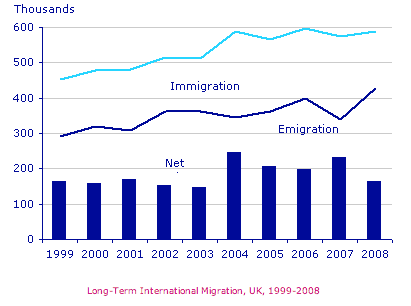
The chart illustrates data about the number of emigrants, immigrants, and net migrants in the British over the period of 10 years, from 1999 to 2008.
From the statistics, it can be inferred that both immigration and emigration rose considerably over the period shown.
In addition
, both approximately experienced the same changes with the same slope but different figures. Linking Words
Also
, the bar chart reaches its peak in 2004 and 2007.
In 1992, the figures for immigrant and emigrant individuals stood at nearly 450000 and 300000, respectively. Linking Words
Then
, they contain a swift increase by the end of 2002. After that, they remained steady for one year which is more than 500000 for immigration and 350000 for emigration. After 2003, Linking Words
while
migrant people made up for partial growth in their number and just under 600000 left the country, immigrants comprised a mild decrease of 100000 people. Linking Words
In addition
, net migration constitutes a constant process over these years.
After 2004, the rate of immigration and emigration fluctuated, and the folk who entered the UK reached a peak at 430000. Linking Words
Following
Linking Words
this
, the third type climbed back to the number of 160000 in 2008.Linking Words