
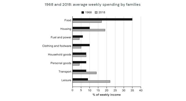
The given bar graph shows information about families' expenditure in a given country from their weekly wages between the period 1968 and 2018.
Overall
, the most important factor emitting from the graph indicates that more money was spent on food in 1968 Linking Words
whereas
the highest was on leisure in 2018. Families spent the same amount on household goods.
Linking Words
To begin
with, in 1968 the highest consumption was of food which is about 35% of their weekly allowance followed by housing and clothing and footwear about 10 %respectively, Linking Words
moreover
,less income was used for fuel and power and personal goods.
Linking Words
However
, approximately 18% was spent on food, with leisure being the most expensive activity which was about 23%. the clan did not use much capital from their weekly income. Linking Words
Also
, both families spent the same amount Linking Words
was
on household goods.Unnecessary verb
apply