
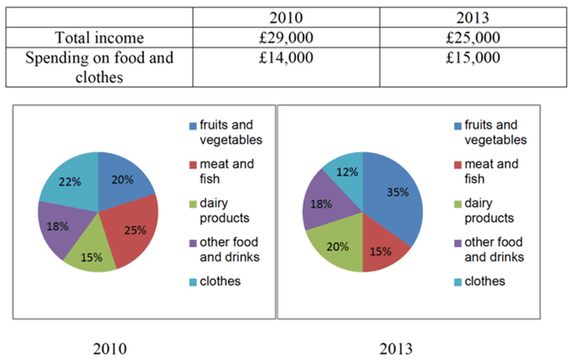
The pie chart
illustrate
the Change the verb form
illustrates
expenditure
and income on Use synonyms
food
and Use synonyms
clothes
per family in the UK.
Use synonyms
Overall
, it is clear from the pie charts that the higher Linking Words
expenditure
was on meat, fish, fruit and vegetables between 2010 and 2013. As far as the table, there was little change in both years (2010 and 2013).
Use synonyms
To begin
with, the average income in the UK was 29000 in 2010, Linking Words
while
in 2013 Linking Words
this
figure decreased to 25000.Spending on Linking Words
food
and Use synonyms
clothes
accounted for 14000 in 2010, Use synonyms
whereas
in 2013 Linking Words
this
figure increased to 15000.
As far as pictures, in 2010 the Linking Words
expenditure
on fruit and vegetables accounted for 26% which is two times higher than the Use synonyms
expenditure
on Use synonyms
clothes
in 2013, Use synonyms
however
, the figures for other Linking Words
food
was 18% and it was still unchanged in 2013. Use synonyms
Furthermore
, in 2013 the figures for Linking Words
food
and vegetables was 30% which is Use synonyms
also
two times bigger than Linking Words
clothes
in 2010.Use synonyms
In addition
to Linking Words
this
, daily products accounted for only 12% in 2010, Linking Words
whereas
in 2013 Linking Words
this
figure jumped to 16%.Linking Words
Finally
, meat and fish in 2010 and 2013 accounted for 29% and 23% respectively.Linking Words