
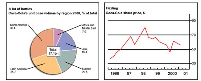
The given chart and the prone graph
as well
highlight data about selling Rephrase
apply
along with
prices for refreshing drunken Coca-Cola.
Linking Words
Overall
, it can be seen that the price of Linking Words
this
cool drink had a fluctuating trend over the period in question Linking Words
while
its popularity among Americans was higher than on other continents.
Looking at the details, in 1996 its price commenced at around 40$ and in the following year, it reached under 70$. After decreasing, it hit a peak at roughly 80$ in 1998 and Linking Words
then
, in the following two years; it fluctuated steadily and Linking Words
conversely
, in 2000 hit a tough with under 50$ and in the second half of Linking Words
this
year stopped at 60$ Linking Words
subsequently
.
Regarding the pie chart, North America was at the top of the list with 30.4 per cent. Linking Words
In addition
, it was followed by Latin America with five per cent lower than it. Followingly, Europe was ranked third with one-fifth. Asia had only 16,4 portions.
Linking Words
Finally
, Africa and the Middle East both had only seven per cent which was nowhere near as high as others.Linking Words