
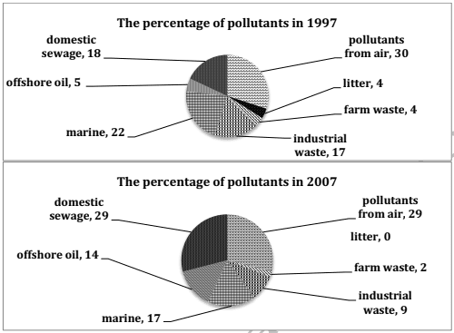
The two pie charts delineate the information about the proportion of different kinds of generated material thrown into a specific portion of the ocean from 1997 to 2007.
After analysing the pie charts, it can be clearly seen that a negligible difference was seen in the pollutants entering from air in both years.
In contrast
, 2% of the farm waste was generated in the former year which was almost twofold in the latter year. Linking Words
Furthermore
, the contribution of domestic sewage was about 18% in 1997, whilst in 2007, it increased by 11%. Linking Words
Additionally
, the litter was 0% Linking Words
last
year but in 1997 it was 4 %.
Linking Words
Moreover
, the chart depicts that a difference of 8% was seen in the industrial waste in both of the pie charts. The percentage of offshore oil in a given two years was about 19% collectively. The involvement of marine was about 22% and 17% in 1997 and 2007 respectively.
Linking Words
Overall
, it is striking that the significant majority of pollution was caused by air in both years, Linking Words
whereas
the minority of pollutants were from farm misuse in 1997 and 2007.Linking Words