
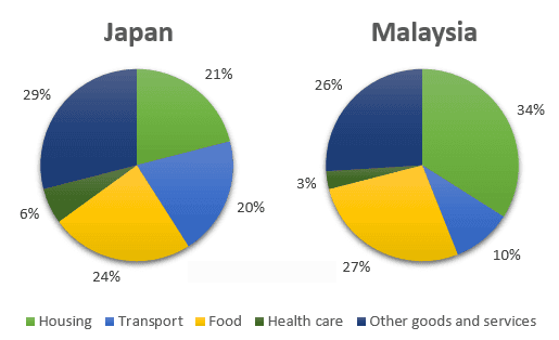
The pie chart illustrates the ratio for household expenses
such
as Housing, transportation, Food, Linking Words
healthcare
and other Use synonyms
goods
and Use synonyms
services
in two different countries Japan and Malaysia in 2016.
Use synonyms
Overall
, most Japanese people are spending the highest amount share for other Linking Words
goods
and Use synonyms
services
and the least on Use synonyms
Healthcare
. Use synonyms
While
in Malaysia the population spent on housing and the lowest is in Japan.
As per the pie graph, in Linking Words
Japan
the population used a large number of shares of salaries spent on other Add a comma
,Japan
goods
and Use synonyms
services
29% in 2010 and on Food 24%. Use synonyms
Furthermore
, for transport and ,housing they are spending almost the same per cent 20% to 21% and the least income they use in the Linking Words
healthcare
sector in the year 2010.
Malaysian community used their biggest wages part for housing 34% in 2010 . After their expenditures in food and other Use synonyms
goods
and Use synonyms
services
27% to 26% in 2010. On the other ,hand they use fewer amounts on Use synonyms
healthcare
and transport facilities.Use synonyms