
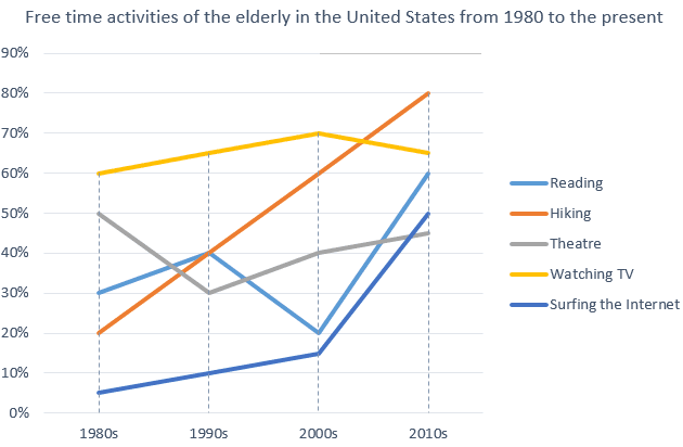
the line graph illustrates data on how elderly people spent their leisure time from 1980 to 2010 in the United States.
Overall
, hiking showed the highest rate Linking Words
at the end
of the Linking Words
period
.
In 1980, 60% of people spent their free time watching TV and Use synonyms
this
rate rose to just over 60% in 2010. Surfing the Internet showed the lowest point among the free time activities at the beginning of the Linking Words
period
. It started at approximately 5% and it showed a 10 times higher percentage in 2010. The percentage of reading activity showed some fluctuations. It started at 30% and it stayed at 60% in 2010.
Compared with others , Hiking showed an upward trend. Its rate increased dramatically from 20% to 80%. Use synonyms
However
, theatre indicated the second highest point at the beginning of the Linking Words
period
, it showed the lowest point Use synonyms
at the end
of the Linking Words
period
. It began at 50% and stayed under 45 % in 2010.Use synonyms