
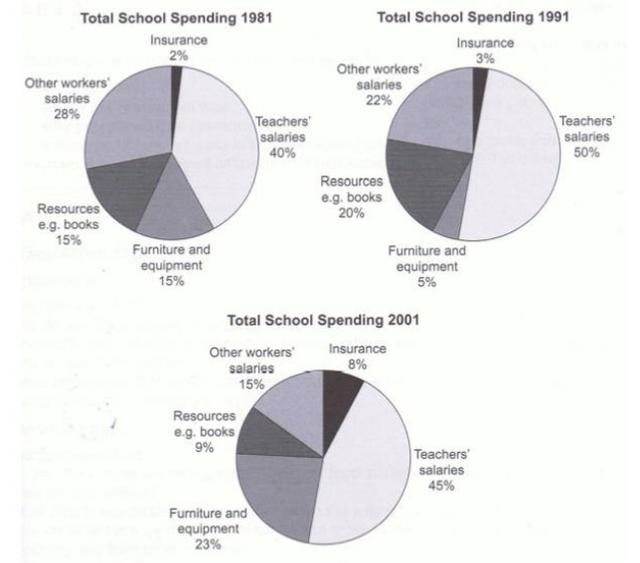
These pie charts compare five categories of a particular UK school expenditure in three different years.
Overall
, Linking Words
it is clear that
Linking Words
this
school spent the highest proportion of the budget expense in the Teacher’s salary across all three years. Simultaneously, Insurance was the lowest portion of spending in 1981, 1991, and 2001.
As can be seen, Teachers’ salaries accounted for 40% of the total money, which the school used in 1981 and it rose slightly to half that surprisingly it experienced a minimal decline in 2001 to 45%. Meanwhile, Furniture and Equipment and Resources started at the same level in 1981 at 15%. Linking Words
While
the number in Furniture and Equipment fell dramatically to 5%, Resources showed a significant growth to 20% in 1991, and the trend for those in 2001 was different. Proportion on Resources decreased sharply to 9% Linking Words
in contrast
for Furniture and Equipment jumped to 23% which stood as the second largest expenditure in 2001.
The percentage of the other workers’ salaries witnessed a steady reduction from 28% in 1981 to 22% in 1991 to 15% in 2001.Linking Words