
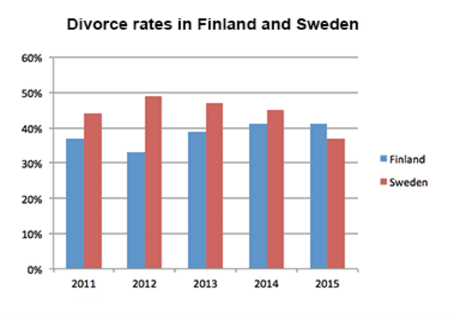
The proportion of married couples' divorces in
Finland
and Use synonyms
Sweden
is depicted by the chart in a 4-year time span. As can be seen, the ratio between the two countries' figures underwent a modest change by the end of the period.
The most notable feature of Use synonyms
this
chart is the change in trend after 2012. Linking Words
According to
the data illustrated, Linking Words
Sweden
's rates had slightly decreased and Use synonyms
Finland
's percentages had moderately risen by that year. Use synonyms
However
, the data's behaviour reversed Linking Words
thereafter
.
Linking Words
Moreover
,it is noticeable that the percentage of divorces in Linking Words
Finland
had been less than that of Use synonyms
Sweden
until the Use synonyms
last
year. But as can be observed, Linking Words
this
changed after Linking Words
Sweden
's figures saw a low of less than 40 per cent in 2015.
Another interesting point is that Use synonyms
Sweden
's data picked at approximately 50 per cent in 2012. Use synonyms
Conversely
, Linking Words
Finland
's divorce rates reached a high of approximately 40 Use synonyms
percent
in 2014 and stayed stable for 2 years.
Change the spelling
per cent
To sum up
, the divorce percentages in Linking Words
Sweden
and Use synonyms
Finland
saw some changes throughout the given period but it was not significant.Use synonyms