
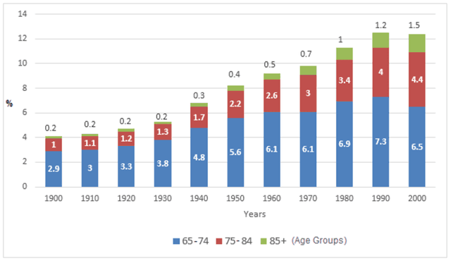
The information about the total population aged 65 and over in the USA between 1900 and 2000 is depicted by the rendered bar graph. The data has been calibrated in the percentage.
To begin
with, In the year 1900 life expectancy above 65 years and over in the US accounted for only 4%. There was a gradual increase observed in the population growth in the US, which accounted for 3% of the increment from 1900 to 1930. Linking Words
while
the life expectancy of people over 85 remained constant.
After that,there was a dramatic increase noticed in the US population, it comprised to 13% in total, in which 7.3% , 4% and 1.2% growth in life shown in people aged 65-75 , 75-84 and above 85 respectively.
Linking Words
However
, during the period between 1990 to 2000 there was a slight drop observed in the age rate. To call it up, the Linking Words
Overall
graph showed an upward trend throughout all the yearsLinking Words