
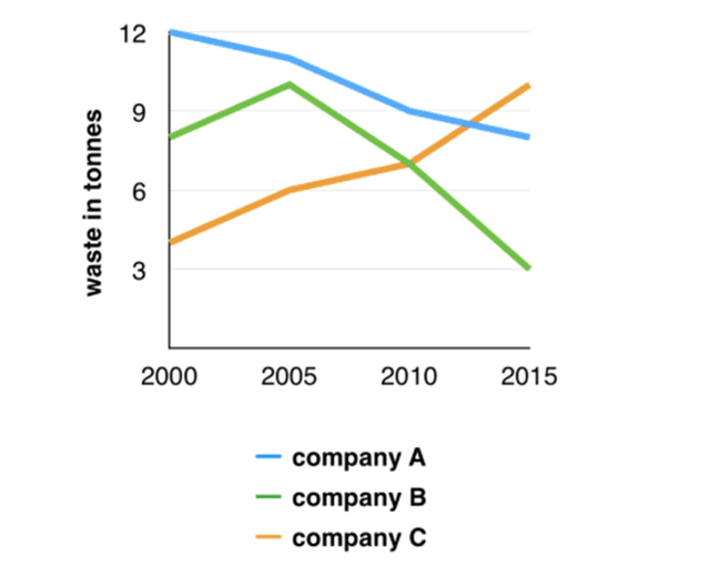
The given line graph demonstrates the quantity of refuse generated by three organizations over a 15-year period from 2000 to 2015.
Overall
, Linking Words
it is clear that
company C witnessed a continuous rise in garbage during the term. Linking Words
Additionally
, company A discharged the highest proportion of waste in the first year studied.
After analyzing the graph, enterprise A produced 12 Linking Words
tonnes
of rubbish in 2000, which outweighed the remaining firms. Use synonyms
Nevertheless
, business A experienced a gradual decline until 2015 with approximately 8 Linking Words
tonnes
recorded. Simultaneously, firm C had a completely opposite trend. From the beginning, enterprise C was at the bottom of the chart, Use synonyms
however
, the figure for Linking Words
this
organization climbed significantly to be the leading company in the magnitude of litter created with nearly 10 Linking Words
tonnes
.
Moving to the remaining business, cooperation B started with about 8 Use synonyms
tonnes
of scrap in 2000 and continued going up to roughly 10 Use synonyms
tonnes
in 2005. Use synonyms
Then
, the data for Linking Words
this
firm dropped considerably to 3 Linking Words
tonnes
of debris in 2015.Use synonyms