
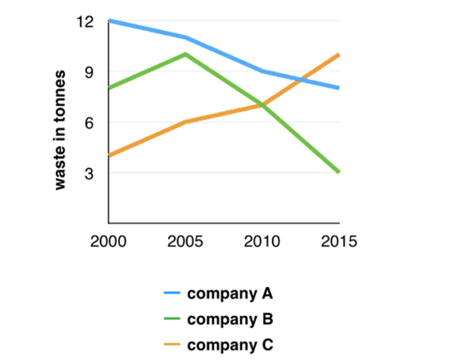
The given line graph illustrates the levels of waste discharged by companies A, B and C over the period of 15 years from 2000 to 2015
Overall
, the amount of waste has a clear difference between companies . Specifically , there was a significant increase in the amount of litter of Linking Words
company
C during the period. Use synonyms
On the other hand
, companies A and B have a considerable decrease over the period of 15 years , from 2000 to 2015
In 2000 , Linking Words
company
A stood at the highest waste in tonnes , approximately 12 Use synonyms
tons
. But the figure of litter produced quickly decline around 8 Use synonyms
tons
in 2015. Use synonyms
Besides
, there was a constant change in Linking Words
company
B. The figure slightly grew from 9 to 10 Use synonyms
tons
over 5 years before it fell substantially to about 3 Use synonyms
tons
in 2015.
In Use synonyms
company
C , there was a continuous rise in the level of garbage discharged from 4 Use synonyms
tons
in 2000 to nearly 11 Use synonyms
tons
in the final year.Use synonyms