
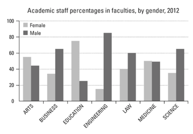
The bar chart illustrates the proportion of employees of two genders in seven different departments at a university.
Overall
, Linking Words
it is clear that
male workers are more than half of all genres of faculty, and the most noticeable data that can be viewed is on engineering, which peaks at 82%.
Looking at the diagram more closely, one can see that the arts and education fields are dominated by female staff. There are around 15% more in the arts, Linking Words
while
there are three times more in education. Linking Words
Moreover
, in business, law, and science departments, the proportion of male workers is higher than that of female workers. Linking Words
By contrast
, males are almost two times higher than females in business and approximately 20% more in both law and science fields. Linking Words
In addition
, the employee percentage in engineering faculty has the most significant margin, Linking Words
while
there is nearly no difference in medicine faculty.Linking Words