
The following two graphs describe the changes in the annual travel time, distance and corresponding methods of people in a country from 1995 to 2015.
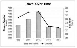
The trip period and distance have witnessed a decline. In terms of time for tours, there was an increase from 372 hours in 1995 to the peak of 387 hours in 2005, before decreasing to 366 hours in 2015.
Additionally
, the same style occurred in the trip range, which climbed to the top of 7150 miles in 2005 and Linking Words
then
slipped to 6650 miles in 2015.
Linking Words
Besides
, there were many turns in the trip mode. To be specific, the proportion of publics who choose private and public transportation to journey recorded an upward tendency, respectively from 62% and 9% in 1995 to 65% and 11% in 2015. Linking Words
By contrast
, there was a lower percentage of people choosing walking/cycling to go to scenic spots, from 28% in 1995 to 24% in 2015.
Linking Words
Overall
, with the development of society in Linking Words
this
country, movement length and time witnessed a declining trend, and more people prefer to take transportation to tour rather than by walking or cycling.Linking Words