
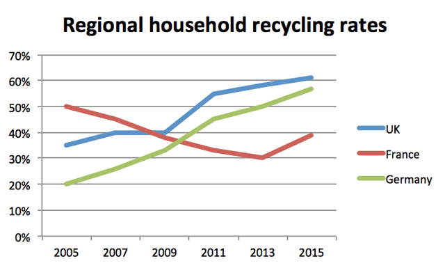
The graph gives data on regional household recycling rates from the UK, France and Germany for a time period of 10 years, between 2005 to 2015.
Overall
, from the beginning to the end of the period depicted, where we can observe increases and decreases, we can see that the UK and Germany had an upward trajectory as opposed to France, which had a downward slide.
Linking Words
According to
the information provided, which is detailed, the UK’s usage of sustainable ratios jumped from 20% to just over 60%. Its largest boost was between 2009 to 2011 when it spiked from 40% to 55%. Germany, Linking Words
in particular
, demonstrated the greatest expansion over the timeframe rising steadily from 20% to almost 60%.
Linking Words
In contrast
, France apexed at 50% in 2005 and Linking Words
then
steadily fell and bottomed out at 30% in 2013 before recovering to 40% in 2015 presenting by the end of Linking Words
this
analysis similar results to the ones achieved by Linking Words
this
same country in 2009.Linking Words