
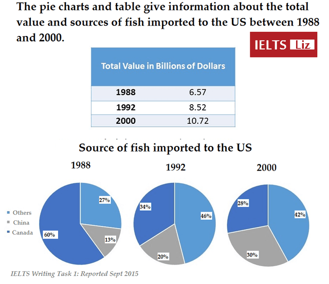
The table and the pic depict the global value of fish and the main countries exporting them to the US from 1988 to 2000.
Overall
, there was a general increase in fish costs throughout the years. Linking Words
However
, the proportion of each importer of sea creatures that exports to the United States has fluctuated between the reported years.
In 1988, the general fish value was 6.57 billion dollars; meanwhile, in 2000, its value represented 10.22 billion dollars, which nearly doubled. Linking Words
Furthermore
, the biggest exporters of both years are not the same, since in the first year it is Canada with 60%, and Linking Words
then
it is the other countries with 42%.
The pattern of each chart changes from year to year. Canada was the first importer; Linking Words
nevertheless
, it was the Linking Words
last
one in 2000 , representing only 28%. In the meantime, China never stopped increasing , going from 13% to 30% in 3 time periods, Linking Words
while
the other regions reached their highest point in 1992 , taking 46% of the market.Linking Words