
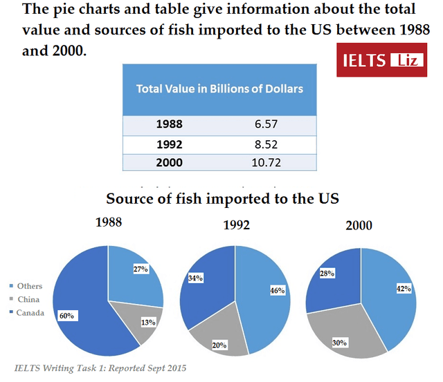
The pie chart below shows the evolution of the total value and the variety of sources of fish imported to the USA between 1988 and 2000.
Overall
, there was an increase in the total money produced by the fish commerce arriving in the USA, contrasted by a significant evolution in the different sources between 1988 and 2000.
From 1988 to 2000, there was a constant increase in the total value of the products imported to the United States of America. In 1988, the quantity was about 6,57 billion dollars and in 1992, of 8,52 billion dollars. Linking Words
Moreover
, between 1992 and 2000, it raised 2,2 billions from 8,52 dollars in 1992 to 10,72 in 2000. Linking Words
Consequently
, Linking Words
this
market is being driven by the United States of America, and is being developed with a rise in the amount of money spent by the United States of America.
Canada was the major producer of the USA's imported fish in 1988, with 60% of the total importation, Linking Words
while
China had only a 13% and the other countries a 27%. Linking Words
However
, in 1992, the percentage in Canada decreased to 36% , giving the protagonism to the other countries that got a 46%. China practically doubled its percentage to 20%. Linking Words
Furthermore
, all three countries remained stable between 1992 and 2000.Linking Words