
The pie charts give information regarding the expenses of American Citizens the category includes 7 types
such
as Linking Words
food
, cars, petrol, etc. in the years 1966 and 1996.
Use synonyms
Overall
, In 1966 there was a big percentage of Linking Words
food
consumption Use synonyms
while
the least one was computer users Linking Words
whereas
, in 1996, the highest rate was in car users. As we can see the small piece was in Linking Words
food
.
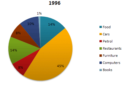
Glacing at the pie charts reveals that the antiquity human beings like in 1996 the first expenses were in Use synonyms
Food
and cars Use synonyms
while
other amenities had an approach rate. Furniture has 10 per Linking Words
cent
, Petrol 9 per Use synonyms
cent
, and restaurant 7 per Use synonyms
cent
. Use synonyms
In addition
, other expenses had decreased over the year 1966, in comparison with the year 1996, the first rate was in cars and Linking Words
food
is the second percentage with a figure of 14 per Use synonyms
cent
, Use synonyms
instead
of that other categories introduce an equal percentage except the restaurant has 14 per Linking Words
cent
is the same with Use synonyms
Food
.Use synonyms