
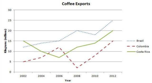
The line graph illustrates changes in the levels of coffee
exports
in three South American countries in the space of a decade,mainly from 2002 to 2012 and is measured in millions of kilograms.
Use synonyms
Overall
,the most significant fact to emerge from the graph is that despite some fluctuations,over the period as a whole the levels of Linking Words
exports
rose in all three countries and Use synonyms
Brazil
accounted for the highest rate Use synonyms
at the end
of the period.
In more detail,Linking Words
Brazil
and Use synonyms
Costa
Use synonyms
Rica
produced the most proportion of coffee.They began at a similar level of between 12 and 15 Use synonyms
million
kilograms in 2002,but,Use synonyms
while
the coffee exported from Linking Words
Brazil
increased gradually over the following four years,exchanges from Use synonyms
Costa
Use synonyms
Rica
experienced a significant fall to around 7.5 Use synonyms
million
.Use synonyms
However
,they bo5h Linking Words
then
followed a similar trend,increasing steadily to 20 Linking Words
million
(Use synonyms
Costa
Use synonyms
Rica
) and 25 Use synonyms
million
(Use synonyms
Brazil
).
Use synonyms
Conversely
,Colombia had a more erratic way of distributing than the other two countries.Linking Words
Exports
stood at Use synonyms
million
kilograms per year in 2002,which was lower than Use synonyms
Costa
Use synonyms
Rica
or Use synonyms
Brazil
.They overtook Use synonyms
Costa
Use synonyms
Rica
in 2006,with Use synonyms
exports
reaching 12 Use synonyms
million
,but there was Use synonyms
then
a sharp decrease to 2008 when Linking Words
exports
hit a trough of 2.5 Use synonyms
million
.Use synonyms
Following
Linking Words
this
,Linking Words
exports
surged rapidly to finish the period at 15 Use synonyms
million
.Use synonyms