
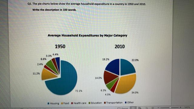
The assigned pie chart reflects the average household liabilities in a nation from 1950 to 2010.
It is evident from the pie chart that the highest spending in 1950 was on housing it was more than a third-quarter
whereas
in 2010 it decreased by 22.0%. Following the second highest expenditure by household was education in 1950 and 2010 it was the same ( about 6.5% and 6.3% respectively). Noticeably, the healthcare and food sectors increased in 2010 it was twice from 1950 in healthcare which was 4.3% Linking Words
on the contrary
food was 3 times doubled which was 34.3%.
Probing ahead, the Rest of the two sectors was in 1950 others was 4.4% and transportation was 3.3% almost nearly. In 2010 it was upsurged others were liabilities accounted for 19.24% ,whilst transportation was 14.0%.
Linking Words
Overall
, In the ending year of households the highest expenditure on housing and food sectors. Linking Words
Whereas
most least spent on health.Linking Words