
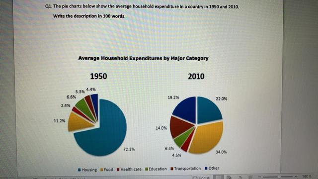
The pie charts display information on what households spent their money on in 1950 and 2010.
Overall
, it can be explicitly observed that in 1950, housing accounted for three-fourths of the total expenditure, and the rest of the expenditure, like food,healthcare,education, transportation, and others, comprised the remaining one-fourths.Linking Words
However
, in 2010, food was the largest household expenditure, followed by housing and the rest.
It is quite obvious that housing in 1950 was exactly 72.1%, which was the highest compared to other categories,but 60 years later, it dramatically fell to 22%. Linking Words
In contrast
, the average Linking Words
expediture
was 11.2% in 1950, which upsurged to 34% in 2010.It is crystal clear that health care had a leap from 3.3% in 1950 to 14% in 2010.
Regarding healthcare, transportation, and others, the Correct your spelling
expenditure
expediture
increased over the span of 60 years. The most significant increase was seen in the figure of transportation, at 3.3% in 1950 as opposed to 14% in 2010, Correct your spelling
expenditure
whereas
the Linking Words
expediture
Correct your spelling
expenditure
of
education showed a slight decrease from 6.6% to 6.3% approximately over the span of time.Change preposition
on