
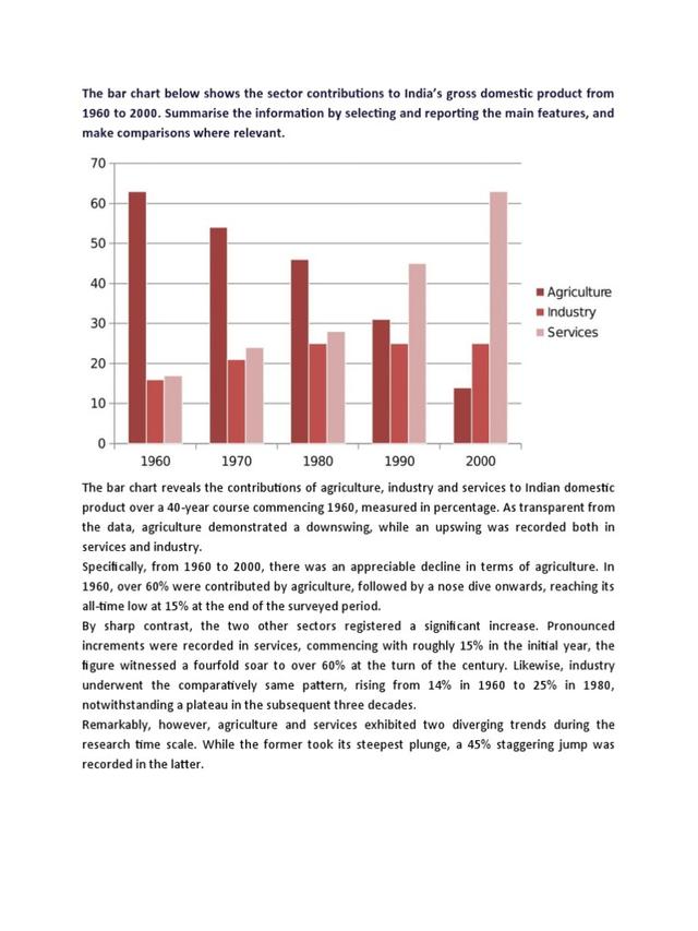
The bar graph compares information about the sector's contribution to India's domestic product between 1960 and 2000.
Overall
, it is evident that "Agriculture" witnessed a significant decrease despite being dominant at the beginning of the time. Linking Words
Besides
that, "Service" went up substantially in spite of being the lowest one at the initial point.Linking Words
Moreover
, it is Linking Words
also
worth noting that Industry saw some fluctuations over the period.
Plausible as Linking Words
this
seems, the product of agriculture recorded just above 60 in 1960, afterwards,Linking Words
firstly
,it experienced a slight decline to nearly 50 in 1970. Linking Words
Furthermore
, Linking Words
secondly
,it was higher than 30 during 1980 and 1990 before plummeting to around 10 Linking Words
at the end
of the period.
Linking Words
In contrast
, Linking Words
initially
, the stage of service products was 15. From 1960 to 1980, there was a marked growth to just under 30. Following that, it reached the highest result of 65 in 2000.
Linking Words
In particular
, it can be seen that the category of industry represented the least number at roughly 14. Linking Words
Last
but not least, it was 20 in three decades. (1980-1990-2000).Linking Words