
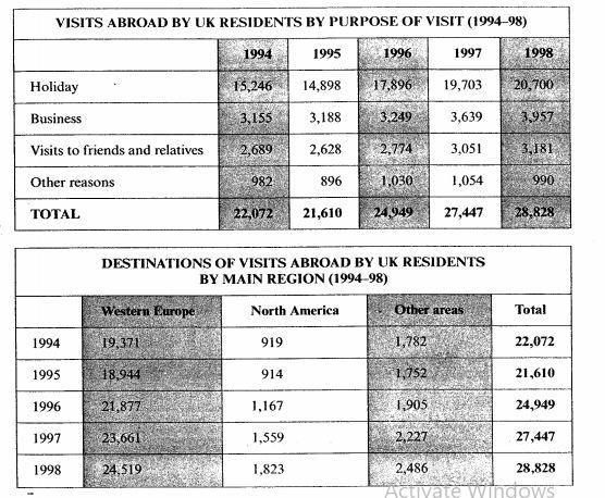
The first table diagram delineates the number of
travelers
who visit abroad in the UK by the purpose of the trip during a 4-year period between 1994 and 1998. Change the spelling
travellers
On the other hand
, the second chart illustrates the amount of UK visitors by their Linking Words
last
stop during the same period.
Linking Words
Overall
, as illustrated by the first graph, the figure for the holiday undoubtedly outweighed the other elements, Linking Words
while
the data for Western Europe from 1994 to 1998 contributed the highest part in the second chart.
Regarding the above chart, it is evident that the record of the business and paying a visit to friends and relatives witnessed an upward trend. Linking Words
In particular
, the business rose slightly by 802 units from 1994 to 1998, Linking Words
while
the proportion of Linking Words
travelers
who visit their relatives was 492 units lower than the business during the same timescale. Change the spelling
travellers
In contrast
, the figure for holidays and other reasons experienced a fluctuation in 4 years. Both ratios dropped slightly from 1994 to 1995. Linking Words
Additionally
, the holiday continuously increased from 14898 to 20700 dwellers in 3 years from 1995. Linking Words
However
, the other reasons slumped moderately from
1054 to 990 inhabitants between 1997 and 1998.
In terms of the second diagram, there is no doubt that all proportions decreased slowly in 1 year from 1994. Linking Words
Nevertheless
, the figures for Western Europe and North America climbed noticeably by 5575 and 909 units respectively between 1995 and 1998. Eventually, the other regions experienced a considerable increase of 784 visitors during the same period.Linking Words