
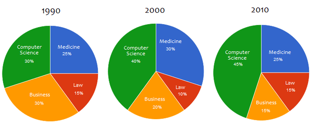
The given pie charts represent the percentage of National University's graduates from four different majors in three consecutive decades, starting from 1990 up until 2010.
Overall
, it can be noticed that, during those 20 years, Computer Science degree receivers were able to maintain Linking Words
its
position as the leading major with the largest portion of the charts.
In the first ten years, the diagram highlights that there was a significant rise in the number of students graduating from Computer Science Correct pronoun usage
their
major
compared to the other. In comparison, the percentage of Medicine graduates experienced an increase as well, but not as notable as the previous major. Fix the agreement mistake
majors
On the other hand
, both Business and Law majors' percentages experienced a downfall.
Linking Words
Subsequently
, in the next ten years, it is very Linking Words
noticable
that the majority of the chart was taken over by Computer Science graduates. Correct your spelling
noticeable
Furthermore
, there was growth in students graduating from the Law major. Linking Words
Additionally
, Linking Words
in contrast
with the first period, the Medicine degree grantees' percentage fell. Linking Words
However
, the Linking Words
statistic
of Business degree receivers consistently went down.Fix the agreement mistake
statistics