
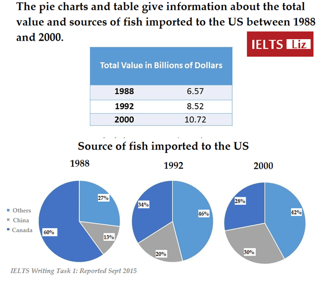
The provided pie charts depict a comparison of the rate of countries that imported fish to the US over 12 years and the table shows the information on the total value in billions of dollars in three different years.
A glance at the illustration makes it clear that Canada was the leader in importing fish before others replaced it, meanwhile, there was a slight growth in China throughout the period in question.
In addition
, the Linking Words
year
2000 was the most profitable Use synonyms
year
compared with others.
Looking at the details of the pie charts, it can be clearly observed that in 1988 Canada dominated representing three-fifths.Use synonyms
However
,by 2000: in 12 years Linking Words
this
number had decreased by more than
three times less.Linking Words
Consequently
,others ranked first by experiencing a noticeable increase.
As far as China is concerned,it witnessed slight improvement which reached 30% from 13%.When it comes to total value , Linking Words
year
by Use synonyms
year
it increased by 2(billion in dollars) and did not see a fall.Use synonyms