
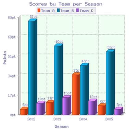
The provided column chart illustrates the
points
obtained by Use synonyms
Teams
A, Use synonyms
B
, and Use synonyms
C
across four distinct seasons. Notably, Use synonyms
Team
Use synonyms
B
outperformed the others consistently, securing the highest scores from 2002 to 2005. Use synonyms
Conversely
, the lowest score shifted from Linking Words
Team
A in 2002 to Use synonyms
Team
Use synonyms
C
in 2004.
Commencing with the year 2002, Use synonyms
Team
Use synonyms
B
achieved 82 Use synonyms
points
, Use synonyms
while
Linking Words
Teams
Use synonyms
C
and A lagged behind with 10 and 5 Use synonyms
points
, respectively. Use synonyms
This
trend persisted in 2003, with Linking Words
Team
Use synonyms
B
experiencing a 20-point decrease, Use synonyms
while
Linking Words
Teams
A and Use synonyms
C
saw increases of 6 and 5 Use synonyms
points
, respectively.
In 2004, there was a notable shift as Use synonyms
Team
Use synonyms
C
replaced Use synonyms
Team
A with the lowest scores. Use synonyms
Team
Use synonyms
B
witnessed a decline to its lowest score of 43 Use synonyms
points
, Use synonyms
while
Linking Words
Team
Use synonyms
C
Use synonyms
also
experienced a decrease to 12 Linking Words
points
. Use synonyms
Conversely
, Linking Words
Team
A demonstrated a significant improvement, nearly tripling its score to 35 Use synonyms
points
. Use synonyms
Additionally
, in 2005, Linking Words
Team
Use synonyms
B
's scores rose to 55 Use synonyms
points
, Use synonyms
while
Linking Words
Teams
A and Use synonyms
C
witnessed declines of 8 and 5 Use synonyms
points
, respectively.Use synonyms