
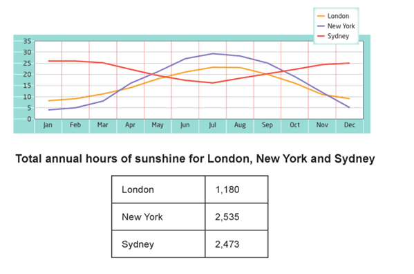
The line graph illustrates London, US and Sydney's average temperatures over the year. The table chart shows continuous hours of sunshine in three countries. It's clear from the graphs above that the temperature in New York has been the highest in July among the rest of the months,
While
continuous sunshine hours are found in the United Kingdom.
Linking Words
According to
what is shown, temperatures in both New York and the UK have risen slightly, followed by a gradual decrease, and they started and ended at the same percentages 5 and 10, respectively. Linking Words
Moreover
, America and London have been selected as the top countries reaching a peak in the middle of the year. Linking Words
Also
, they have almost the same cross-section data at the beginning of Apr measured by 12.5 degrees and in the Linking Words
last
quarter of Nov reaching 10 degrees. Linking Words
Furthermore
, the temperature in Sydney is the most elevated at the first part of the chart and the end of it. America has the highest significant annual hours of sunlight followed by Sydney and the UK. It's obvious that New York is a common factor between the two charts in that it is the hottest among the countries.
In conclusion, the evidence demonstrates that the US has an enormous increase in the summer between May and Sep when most people tend to go to the beach. Linking Words
However
, the United Kingdom is the lowest country in terms of temperature, and most Kuwaitis visit the United Kingdom during Linking Words
this
season.Linking Words