
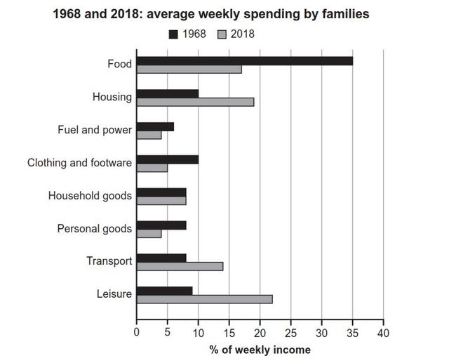
The chart above illustrates the percentage of income spent on average by households in one country in 1968 and 2018 respectively.
Generally, what stands out from the chart is that families spent most on food in 1968,
while
the highest proportion of their earnings was spent on leisure activities in 2018. Linking Words
In contrast
, fuel and power expenditures were the lowest percentage of their weekly spending in both 1968 and 2018.
In 1968, food was the main consumption that cost the most of a household’s weekly income, accounting for 35%, more than 3 times as large as the figure for housing (10%). Linking Words
On the other hand
, they spent the least on fuel and power, with the data standing at around 6%. Aside from Linking Words
this
, the other categories of expenditure were reached to around 8% in Linking Words
this
year.
Diverting your attention to the data in 2018, most of the household’s weekly spending was comprised of leisure activity consumption, with the figure reaching 22%, more than twice as large as the percentage for household goods (8%). Linking Words
On the contrary
, the least amount of their income was spent on fuel and power, which is just 4% of the entire expenditure per week.Linking Words