
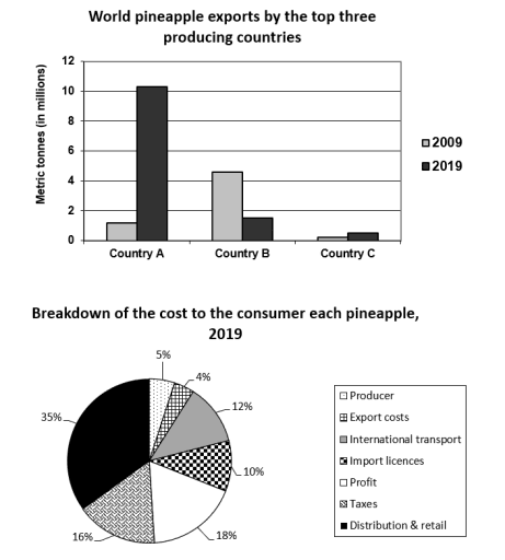
The bar chart illustrates the international pineapple shipments by the top three nations that produced them in 2009 and 2019,
while
the pie displays the breakdown of its price for customers in the latter year.
Linking Words
Overall
, Linking Words
it is clear that
country B emerged as the most common exporter of fruit in 2009, Linking Words
whereas
nation A became the most prevalent in 2019. Linking Words
Furthermore
, distribution contributes the majority of the selling cost; Linking Words
in contrast
, production costs share a minor portion.
Looking at the details of the first graph, Country A produced only one million metric tons of pineapple in the beginning, which increased to over 10 million in the following decade, making it by far the largest number among the others. Linking Words
However
, those in B started with 5,000,000 metric tons of goods, decreasing to under 2,000,000 in the next ten years. In comparison, those in Region C remained relatively stable, with about 40,000 metric tons of items.
Moving to the next diagram, delivery and retail accounted for 35%, which was by far the largest allocation among others. Linking Words
In addition
, profit and taxes followed with 18% and 16%, respectively, yet the producer made the smallest percentage (4%).Linking Words