
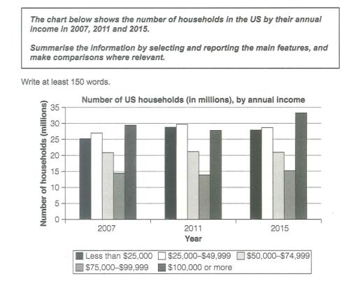
The bar graph illustrates how many families there were in the United States by their yearly income in three years. 2007, 2011 and 2015.
Overall
, the number of households with every range of income increased over the period. The figure for $100,000 or more had the maximum numbers and ranked Linking Words
first,
Linking Words
while
that for $75,000-$99,999 remained as the minimum, ranking Linking Words
last
in all three years.
Linking Words
Initially
, figures for less than $25,000 and $25,000-$49,999 were 25 million (25M) and 27M, respectively. After they saw an increase to almost 30M, there was a minimal decrease of 2M for both.
$50,000-$74,999 and $75,000-$99,999 were 20M and 15M, respectively in the first year. Linking Words
Although
there was no change for the former in 2011 and 2015, the latter experienced a low at 14M and marginally grew to 15M. $100,000 or more stood nearly at 30M in 2007 and showed a decline of 2M, followed by a substantial rise to 33M.Linking Words