
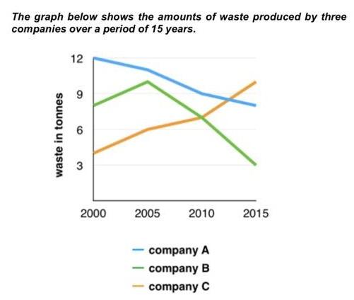
The line graph illustrates the quantity of
wast
in three different companies (A,B and C) from 2000 to 2015. Units are measured by Correct your spelling
waste
tones
. Use synonyms
Overall
, it can be seen A and B companies were the biggest residue producer at the beginning though they Linking Words
have shown
a decrease Wrong verb form
showed
at the end
of the period and Linking Words
Use synonyms
company
C had a completely opposite trend.
In 2000, Capitalize word
Company
Company
A was the topmost waste creator with 12 Use synonyms
tones
followed by Use synonyms
Use synonyms
company
B with approximately 8 Capitalize word
Company
tones
. Use synonyms
However
, Linking Words
company
A tried to cut its residue down and experienced a steady drop to around 8 Use synonyms
tones
in 2015. Use synonyms
Also
, the latter rose to 11 Linking Words
tones
in just 5 years (2005) Use synonyms
Linking Words
then
fell to 3 Correct word choice
and then
tones
Use synonyms
at the end
of the period.
Linking Words
Finally
, Linking Words
company
C was Use synonyms
in
the bottom of waste amount with 4 Change preposition
at
tones
in 2000. Use synonyms
Although
, Linking Words
this
trend increased dramatically and stood at about 10 Linking Words
tones
in 2015 which is the highest amount among others.Use synonyms