The chart below shows the number of households in the US by their annual income in 2007, 2011, and 2015. Summarize the information by selecting and reporting the main features, and make comparisons where relevant.

The chart below shows the number of households in the US by their annual income in 2007, 2011, and 2015.

Summarize the information by selecting and reporting the main features, and make comparisons where relevant.
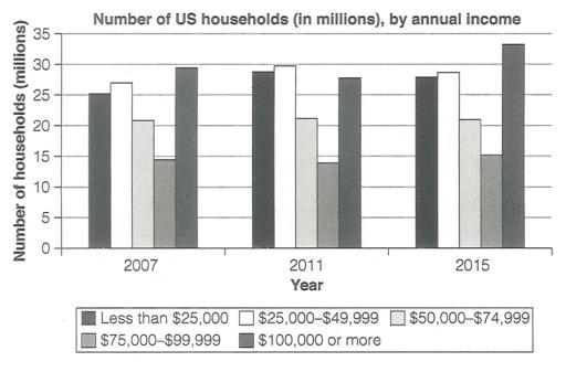
The chart displays how many households in the US by salary per year in 2007, 2011, and 2015.
Overall
, salary distribution among US households displayed similar patterns over the past three years. The bracket of $100.000 or more shows an increased trend,
whereas
the $50.000–$74.400 and $75.000–$99.900 brackets tend to
fell
Wrong verb form
fall
show examples
. $100.000 or more was the highest bracket among five categories in three years, reaching a peak at 33 million households in 2015.
However
, the $75.000–99.900 bracket was steadily the lowest in three years, roughly not over 15 million.
In addition
, the remaining brackets, less than $25.000 and $50.000–74.900, gradually reached a high number in 2011, at around 28 and 30 million, respectively.
Submitted by Keterolac on

Unauthorized use and/or duplication of this material without express and written permission from this site’s author and/or owner is strictly prohibited. Excerpts and links may be used, provided that full and clear credit is given to Writing9 with appropriate and specific direction to the original content.

Sentences: Add more complex sentences.
Common mistake: Your writing should be 150-250 words.
Vocabulary: The word "displays" was used 2 times.
What to do next:
Look at other essays: