
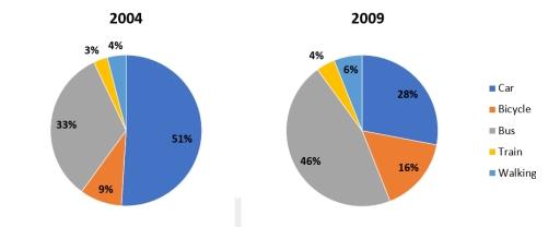
The pie chart illustrates data on the various modes of
transportation
that people generally use to get to university between 2004 and 2009.
Use synonyms
Overall
, buses and cars showed the highest percentages among all modes of Linking Words
transportation
during these years. Use synonyms
Moreover
, in 2009, the number of individuals utilizing buses increased, Linking Words
whereas
the number of people using cars decreased, alongside a growth in the usage of other Linking Words
transportation
methods.
The introduction of car parking charges at the university in 2006 might have decreased the number of car drivers from 51% to 28%, Use synonyms
while
the construction of a new bus stop likely contributed to an Linking Words
increase
in bus users from 33% to 46%. There was Use synonyms
also
a significant rise in bicycle usage, with a total Linking Words
increase
of 7%. Meanwhile, other Use synonyms
transportation
methods, Use synonyms
such
as walking and trains, did not show notable growth, with a 1% Linking Words
increase
for train users and a 2% Use synonyms
increase
for pedestrians.Use synonyms