
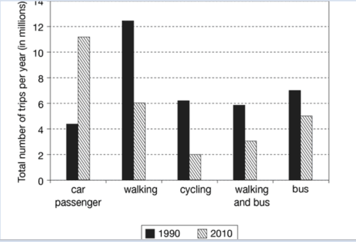
The given chart illustrates information concerning the number of travels made by children in one country for the years 1990 and 2010 to travel to and from school using five different types of transport (car passenger, walking, cycling, walking and bus, and bus). The data is measured by millions.
Looking at the
overall
perspective, it is readily apparent that there was a huge difference over two decades especially, Linking Words
the
types of car Change preposition
in the
passenger
and walking.
A cursory glance at the data reveals that the number of car Fix the agreement mistake
passengers
passenger
was the lowest rate in the year 1990 Fix the agreement mistake
passengers
however
, it dramatically climbed by over 4,000,000 to approximately 11,000,000.
Linking Words
On the other hand
, another eye-catching trend is that Linking Words
method
of walking was the highest Correct article usage
the method
statistics
in 1990 but, after 20 years, there was a decrease of 6 Fix the agreement mistake
statistic
million
in walking. Use synonyms
Also
, the type of cycling declined considerably from about 6 Linking Words
million
to 2 Use synonyms
million
. Use synonyms
Moreover
, using the bus is followed by walking for the year 1990 accounting for about 7 Linking Words
million
and it was slightly dropped by 2 Use synonyms
million
.Use synonyms