
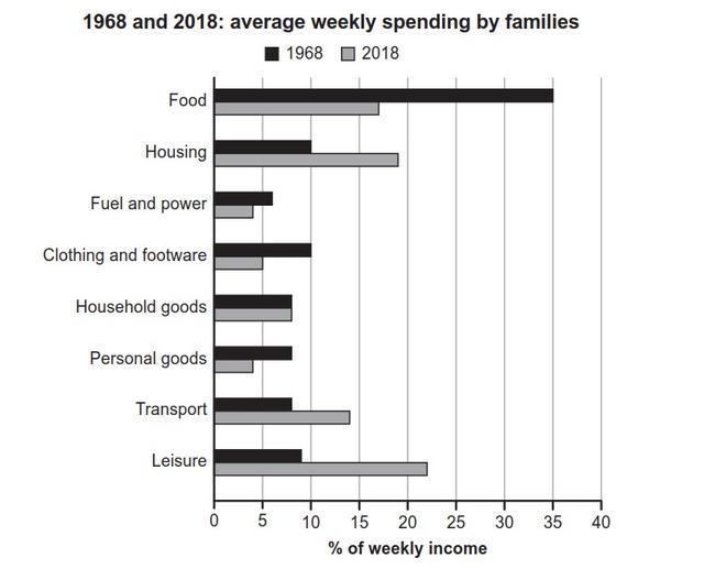
The bar chart illustrates data about what families spend their weekly income on for a duration of two time periods; 1968 and 2018, which is broken down into eight categories.
Overall
, it is evident that the majority of income was used for food during 1968, Linking Words
whereas
it went to luxuries in 2018.
One notable observation is the significantly large proportion of 35% that went towards food during 1968. Linking Words
Moreover
, accommodation and fashion were positively correlated at 10% respectively. Linking Words
Likewise
, about 7% of income was spent on household items, personal goods, and transportation.
Linking Words
On the other hand
, food declined by more than half, Linking Words
whereas
it doubled by more than half for leisure in 2018. Linking Words
Thus
, the majority of money spent during 2018 was predominantly held by leisure at about 27%. Linking Words
Furthermore
, housing increased dramatically from 10% to 18%. Linking Words
Hence
, the only items that both years had in common were fuel and electricity, which were the least spent on for both years.Linking Words