
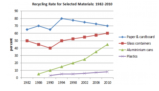
The line chart gives data about the percentage of four different kinds of reusable material over an eight-year period in a certain country.
Overall
, what stands out from the graph is there was an upward trend experienced by the four recycled materials, but we can see that aluminium cars indicated the biggest change rather than paper & cardboard, glass containers and plastics.
Looking at the details, the aluminium cans witnessed significant growth starting from around 2% to 45% from 1982 onwards. Linking Words
However
, there was a steady decrease in the number of glass containers recycled in the two first years, but it began to increase steadily from 1990 towards the end of the time period.
If we look at the details, the paper & cardboard rose slightly, Linking Words
then
declined before it went up considerably to 80% in 1994. After that, it fell moderately to 70% in 2010. It Linking Words
also
can be seen that the plastics saw a little alter from almost 2% to approximately 9% from 1990 onwards.Linking Words