
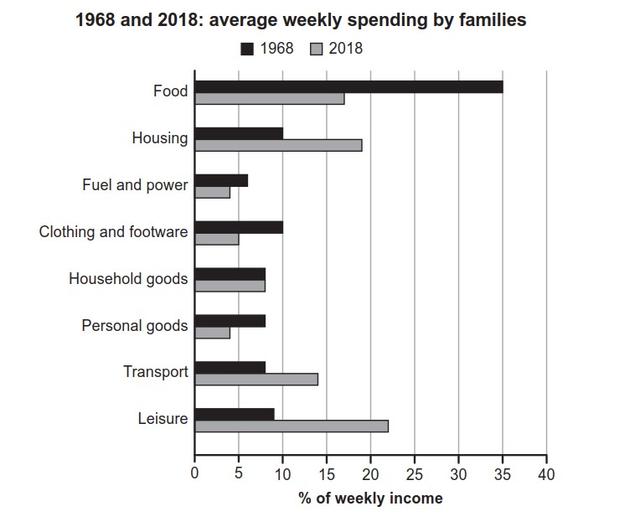
The bar chart illustrates the percentage of weekly income that families spent on different categories in a specific city during the years 1968 and 2018.
It is clear that
food was the largest proportion of expenditure in 1968, Linking Words
while
families spent more money on leisure activities in 2018. Linking Words
Moreover
, fuel and power had the lowest proportion of spending in both years.
Looking at the information in more detail, people spent more on food (35%) than on other categories in 1968. In the same year, expenditure on housing accounted for 10%, which was the same as the spending on clothing and footwear. All other categories constituted less than 10%.
In terms of 2018, the percentage of income spent on food significantly decreased to approximately 17%, Linking Words
while
spending on leisure activities became the largest category at nearly 22%.Compared to 1968, housing expenditure nearly doubled to almost 18% in 2018. Linking Words
On the other hand
, the percentage spent on household goods exhibited a consistent proportion of nearly 8% during both years.Linking Words