
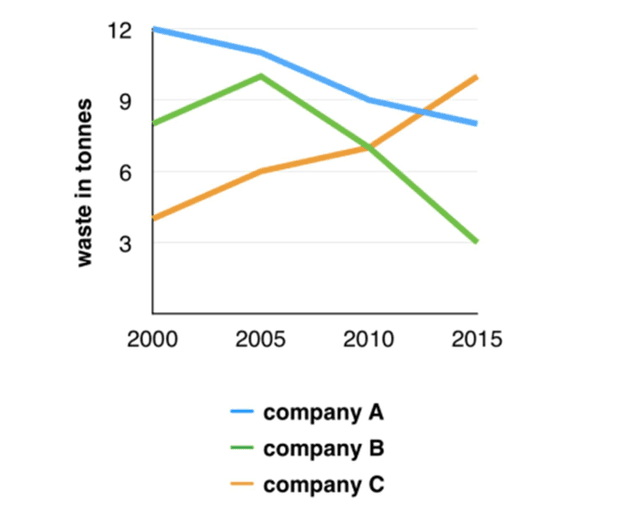
The given line graph delineates the amount of three companies producing
waste
throughout 15 Use synonyms
years
from 2000 to 2015
Use synonyms
Overall
, there had been a downward trend of Linking Words
waste
produced by companies A and Use synonyms
B
over the Use synonyms
years
, Use synonyms
while
Linking Words
company
Use synonyms
C
bucked the trend. Use synonyms
Moreover
, Linking Words
company
A has been witnessed to be the most Use synonyms
waste
produce corporation in 15 Use synonyms
years
More specifically, in 2000, Use synonyms
Company
A ranked first with 12 Use synonyms
tonnes
of Use synonyms
waste
produced, followed by Use synonyms
B
and Use synonyms
C
with 8 and nearly 5 Use synonyms
tonnes
, respectively. In the next 5 Use synonyms
years
, the amount of Use synonyms
waste
released witnessed an increase in companies Use synonyms
B
and Use synonyms
C
with over 10 Use synonyms
tonnes
and roughly 6 Use synonyms
tonnes
, respectively.
Relating to the remaining period, Use synonyms
company
A had planned to reduce Use synonyms
waste
by 4 Use synonyms
tonnes
through the next 10 Use synonyms
years
, allocated with corporation Use synonyms
B
decreased by one-third compared with the first year of the survey. Use synonyms
Lastly
, Linking Words
Company
Use synonyms
C
witnessed an opposite trend by getting to its peak in the Use synonyms
last
year with 11 Linking Words
tonnes
of Use synonyms
waste
producedUse synonyms