
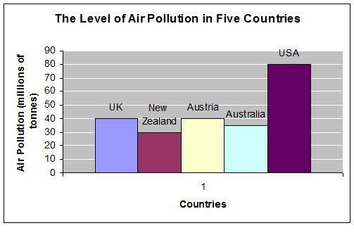
The given bar chart illustrates the
air
pollution levels across five distinct countries; the UK, New Zealand, Austria, Australia, and the USA, measured in millions of Use synonyms
tons
. Use synonyms
Overall
, a clear trend emerges, suggesting a geographical influence on Linking Words
air
quality, with countries in the northern hemisphere generally exhibiting higher levels of Use synonyms
air
pollutants compared to those in the southern hemisphere.
Starting with New Zealand and Australia, both located below the equator line, it is evident that they contribute relatively lower amounts of pollutants to the atmosphere, registering at approximately thirty Use synonyms
million
Use synonyms
tons
and around thirty-five Use synonyms
million
Use synonyms
tons
respectively.
Use synonyms
In contrast
, countries geographically situated above the equator line from the provided data namely the UK, Austria, and the USA, display Linking Words
a significantly higher levels
of Correct the article-noun agreement
significantly higher levels
a significantly higher level
air
pollution. The USA emerges as the leading contributor, with Use synonyms
the
total of eighty Correct article usage
a
million
Use synonyms
tons
of pollutants, which ‘may’ Use synonyms
indicating
a substantial environmental burden. Meanwhile, both the UK and Austria share Wrong verb form
indicate
the
similar level of pollution output, each accounting for forty Correct article usage
a
million
Use synonyms
tons
.Use synonyms