
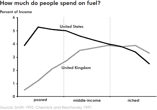
The graph shows the percentage of income spent by drivers on petrol, depending on their social and economical condition, both in the United Kingdom and in the United States of America. In the UK, it's possible observing a sharp surge of the proportion of money earned by poor people on fuel, from few percentage points of income to just under 3%. In comparison to rich, the trend is different: despite they spend more money than the poor, in the first range the course is levelled off,
while
in the Linking Words
second
one, it drops markedly. The situation remains stable approximately of the middle-class, where even though an initial increase from 3% to almost 3.5%, Linking Words
secondly
the rise is slight, Linking Words
thus
it reaches 4% of the gain. Linking Words
Instead
of, in the USA, we can see a different progress: Linking Words
firstly
the line grows up and peaks in the range of the poor people and Linking Words
after
Linking Words
this
, there is a plummet of percentage of earnings spent on petrol between just over 5% Linking Words
initially
to nearly 2.5% of the richest people.Linking Words